It’s Sunday afternoon, and you’re having a nice relaxing weekend, sitting down watching your favorite sporting event. While enjoying the game, you get a high alert email on your phone, noting something’s going on and you need to jump into action. What do you do in these high stress times? Every second counts, and everyone is waiting on you to tell them what’s happening. It would be perfect if you could launch an overview screen and see everything that’s going on, and quickly point out anything that’s standing out.
Enter Graylog Aggregation Charts
Aggregation charts are a great way to visualize your data to find anomalous behavior in your organization. By summarizing your data into quick, easy-to-read visual depictions, you can easily spot out anything that’s out of place.
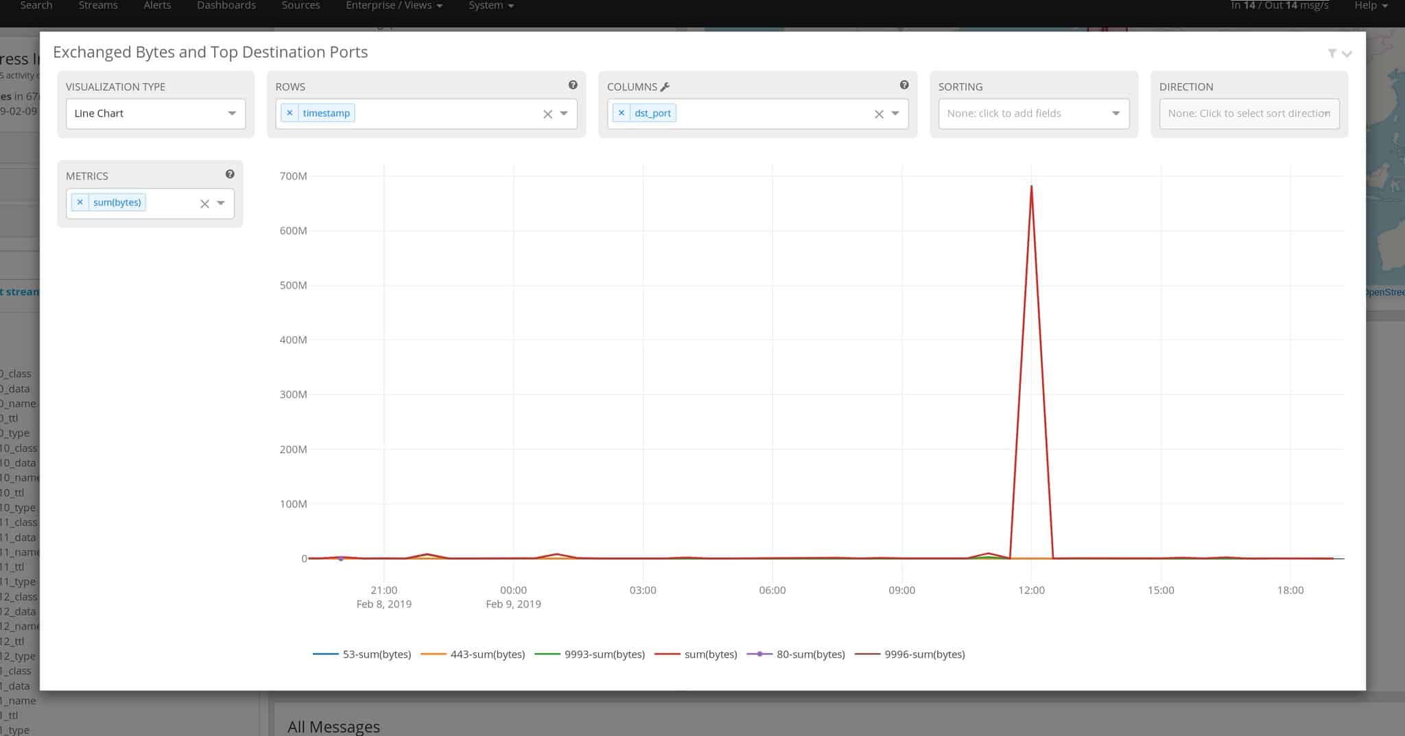
With the game on, you quickly launch your Graylog console to see what’s happening, and you pull up a view with one chart standing out, showing a starting point for the investigation:

As you look at it, you can quickly see a huge spike in traffic around 12:00, way above normal. You now have your timeframe to drill in to and start your investigation into seeing what caused that large spike on the graph.

We have found the hosts during this time, which were affected by the high spike in utilization. Now we can drill in on those two hosts to get to what the issue was.
With Graylog, you have quickly found the cause, reported the root cause of the issue back to the team, and can now enjoy the rest of the game.
Digging Into the Data
Let’s take a closer look at the chart to understand how it was helpful. We created a Line Chart to show the total number of bytes, tied to the destination ports. On the side, you can see we spiked up to ~700 MB of traffic right around 12:00. The timeline for the chart is 24 hours and could be expanded to further to get additional resolution into the graph and trends over time.
Behind the screen, we have already selected a few options. The timeframe has been set on the Extended Search tab, as well as any selections around your streams of data. In this case, below 1 day has been selected around the firewall and DNS data.

What if you need to modify this a bit to get a better view into the data? You can do this by changing the fields at the top. If you look at the ROWS option, the name timestamp in blue text can be edited by clicking to show the field to adjust the time resolution. Same with dst_port, where you can limit the number of ports or expand them to see more details. Sorting the data and putting it in any direction is also available by modifying the respective fields.

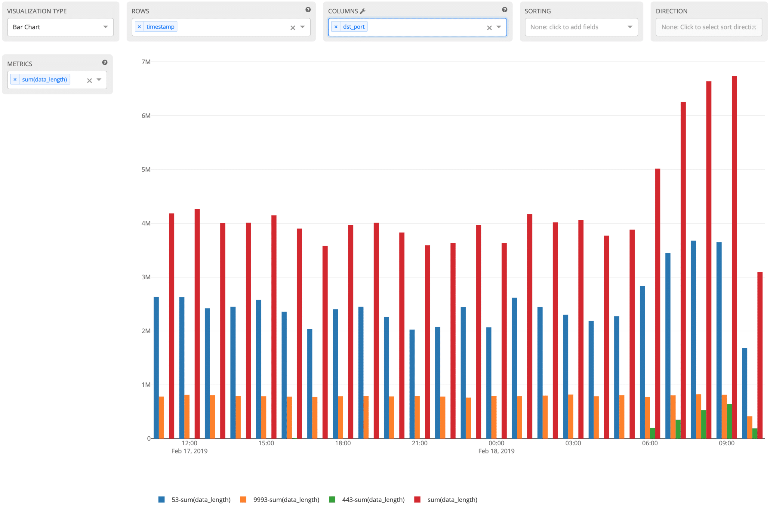
If you want to see this in a different chart, you can modify the VISUALIZATION TYPE to pick the chart type, where it might make it easier to see in a bar chart for instance.

Also, on any of the charts in Graylog, you can use the Widget Filter in the top right to filter out any information you don’t want. In this case, I’m excluding port 53 (DNS) from the data set.

With these powerful aggregation charts, you can build views to quickly find what is going on with trend analysis.
CONCLUSION
In the aggregation above, we quickly showed how to create a chart to find high-volume destination ports affecting your environment. This use case is tried and true for network operations–most network operations staff use these types of charts every day.
You can use aggregation charts in other areas of your organization as well, once the data is coming into Graylog. A few examples include:
- Transactions per min/hour (retail store)
- Support case metrics
- Monitoring equipment status (refrigerator temps, thermostat fluctuation)
- Application response time
You can learn more about views and dashboards by reading the Graylog documentation. Please become a part of our growing community to share your logging stories and get new ideas on how to use your data.
Happy Logging!


