Picture a simple E-commerce platform with the following components, each generating logs and metrics. Imagine now the on-call Engineer responsible for this platform, feet up on a Sunday morning watching The Lord of The Rings with a coffee, when suddenly the on-call phone starts to ring!

Oh no!
It’s a customer phoning, and they report that sometimes, maybe a tenth of the time, the web front end is returning a generic error as they try to complete a workflow. The on-call engineer must open their laptop, connect to the VPN and through one interface or another and seek to build a picture of what is happening.
But where to look first?
-
The Load Balancer logs, looking for strange traffic?
-
The Web Server logs, looking for 50X status codes? Which requests are affected?
-
The App Server logs, looking for errors? Which ones are relevant to this problem?
-
Performance metrics, looking for a resource bottleneck?
Spoiler: we hope you will not be too shocked to discover that the correct answer is a Graylog Operations Dashboard
Here is a log file from the platform:

There are 14 such log files being actively written, logging a total of around 380,000 events daily. Reading the log files directly like this is slow going even with the search tools of modern text editors. Working like this, it is difficult to figure out even basic facts such as when an issue started, which types of workflow are affected or even which part of the infrastructure an error is originating from. There can be thousands of different error events in a log, many benign and regularly occurring long before the issue was reported. In the circumstances, a notepad search through a few log files for “error” is not going to cut the mustard.
OK – How can we make better sense of all these disparate indicators, using Graylog?
At the most basic level, if we pull all the logs from this architecture into Graylog using collectors, we can search for key terms like “ERROR” across all the different log types at once and review the results on a timeline.

This is a useful capability, but we can do better – it’s dashboard time!
Designing an Operations Dashboard
When designing an Operations Dashboard for a specific platform like this, we follow these broad principles:
-
Try to get every metric you might want to view onto a single board for easy comparisons.
-
Start with the highest-level metric of uptime/success at the top, and then drill downwards.
-
Unless we are measuring overall activity, we don’t graph anything except for evidence of problem(s).
-
Metrics that are not positioned in time are not useful – when is as important as what.
-
Simple string searches (“Error”, “timeout”) are useful high level tools, but grouping the results in turn by application, server and type is what makes log aggregation awesome.
-
Follow up visualizations with data tables that contain the data shown, for easy save-to-clipboard and drill-down.
Now, lets make some graphs!
Count the highest level metrics of “Activity”
-
Having a basic indication of how much activity is occurring is crucial.
-
Can tell you if there has been a massive surge of work, or else if your applications abruptly went idle.
-
Starting at the highest level, we first count requests to the load balancer, sorted by request.

Row: timestamp
Column: request
Metric: count()
Type: Bar Chart
Mode: Relative
This is useful, but to understand health we need to see the traffic that is “failing”:
Parse the Load Balancer or Firewall logs to view traffic
When monitoring a system that has a web interface like this one, a good high-level metric to track is how many API requests are returning with erroneous 40X or 50X HTTP status codes.
To make that distinction here, there is a requirement that we parse several fields out of our load balancer or firewall logs (as applicable).
For example, lets parse the AWS Load-balancer log for the following fields.
-
client
-
target_processing_time
-
elb_status_code
-
request
h2 2023-03-07T16:44:37.258775Z app/tf-lb-2022030713390888170000000a/25n7251d3ee489422 111.222.11.55:43331 11.78.166.66:6200 0.000 0.015 0.000 200 200 38 489 “GET https://dingovision:443/api/system/basket/checkout/1.0” “Mozilla/5.0 (Macintosh; Intel Mac OS X 10.15; rv:109.0) Gecko/20100101 Firefox/111.0” QQQHE-QSA-QQQQ28-GQ-SHA256 TLSv1.2 arn:aws:elasticloadbalancing:us-east-1:2513411:targetgroup/tf-20220308165834754600000001/ce33332a240c0c “Root=1-33f22ff-1de6aa423523490545375926” “dingoshipping.net” “arn:aws:acm:us-east-1:2513411:certificate/6663QQ-a8ad-7766BB332” 0 2023-03-07T16:44:37.243000Z “forward” “-” “-” “11.78.166.66.6200” “200” “-” “-“
We can use a Pipeline rule to extract the fields we need using grok:
rule "parse AWS LB log"
when
  true
then
  let x = to_string($message.message);
  let parsed = grok(pattern: "%{NOTSPACE:request_type} %{NOTSPACE:log_timestamp:datetime} %{NOTSPACE:elb} %{NOTSPACE:client:string} %{NOTSPACE:target} %{NOTSPACE:request_processing_time:float} %{NOTSPACE:target_processing_time:float} %{NOTSPACE:response_processing_time:float} %{NOTSPACE:elb_status_code} %{NOTSPACE:target_status_code} %{NOTSPACE:received_bytes:float} %{NOTSPACE:sent_bytes:float} %{QUOTEDSTRING:request} %{QUOTEDSTRING:user_agent} %{NOTSPACE:ssl_cipher} %{NOTSPACE:ssl_protocol} %{NOTSPACE:target_group_arn} %{QUOTEDSTRING:trace_id} %{QUOTEDSTRING:domain_name} %{QUOTEDSTRING:chosen_cert_arn} %{NOTSPACE:matched_rule_priority:int} %{NOTSPACE:request_creation_time} %{QUOTEDSTRING:actions_executed} %{QUOTEDSTRING:redirect_url} %{QUOTEDSTRING:error_reason} %{NOTSPACE:target_port_list} %{NOTSPACE:target_status_code_list} %{NOTSPACE:classification} %{NOTSPACE:classification_reason}",value: x);
  set_fields(parsed);
end
This lets us…
Count Your Load Balancer Error Status Codes by API Request
-
See how many and which API requests are failing.
-
This is useful when trying to understand a sudden spike in failed requests- for example, checking if all of those failed requests were making the same API call, or are all associated with one host.
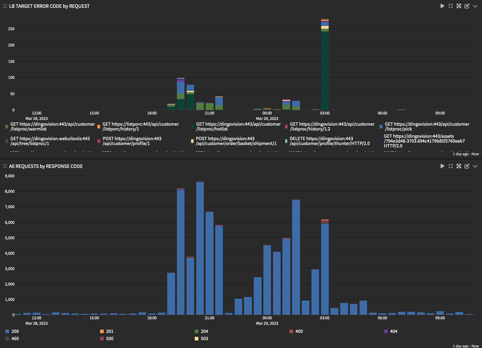
Filter: _exists_:elb_status_code AND NOT elb_status_code:20?
Row: timestamp
Column: client
Metric: count()
Type: Bar Chart
Mode: Relative
Filter: _exists_:elb_status_code
Row: timestamp
Column: elb_status_code
Metric: count()
Type: Bar Chart
Mode: RelativeThis draws us a fairly clear picture of what is failing. Now we need to figure out why it is failing.
Track the processing time of API Calls
-
Before delving the application logs looking for errors, we can easily check for performance problems by inspecting how long API requests are taking to process.
-
The sum of target processing time is a good measure of work performed by the application layer and database.
-
If a particular request is associated with a large proportion of the total target processing time on your environment, either that request is happening very frequently, has poor performance, or both – a data table can inform us which.
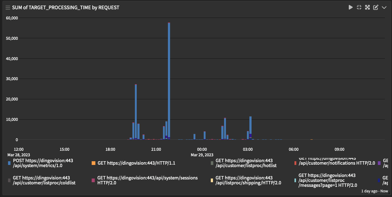

Filter: _exists_:elb_status_code
Row: timestamp
Column: request
Metric: sum(target_processing time)
Type: Bar Chart
Mode: Relative
Filter: _exists_:elb_status_code
Row: request
Metric: sum(target_processing time)
Metric: avg(target_processing time)
Metric: max(target_processing time)
Metric: count()
Type: Data Table
So now we can understand the traffic coming in, see the failure events and spot incidents of poor performance that correlate. Now we are ready to dig into the application logs and look for errors and timeouts around these periods!
Count Timeout by Source (or Application Name)
-
Indicates the existence of timeouts in your log files – useful for detecting connectivity or performance problems.
-
Not all results will be erroneous (there are often benign timeouts printed to log) but a useful view when paired with others.
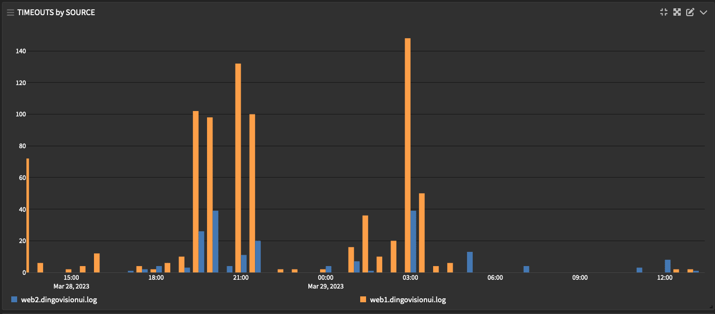
Filter: “timeout” OR “time out” OR “timed out”
Row: timestamp
Column: source
Metric: count()
Type: Bar Chart
Mode: Relative
Count Error by Application
- Simple but surprisingly effective tool: just search the logs for “ERROR” and group the results by source or application name.
-
Not all results will be errors (mean developers are not above printing “no error” or “errors: 0” to their application logs), and some further filtering might be required to wean out the false positives.

Filter: “ERROR”
Row: timestamp
Column: source
Metric: count()
Type: Bar Chart
Mode: Relative
Parse Generic Error Summaries
It is useful to know when a lot of errors occur, as above, but often, it is far more useful to know which error was occurring. Aggregating errors by type is inherently a bit challenging, because there is no standard format to an error message – the text that follows the word “ERROR” tends to be all different formats, lengths and character types. Curse you, developers!
Since it is not feasible to parse error descriptions neatly, we can settle instead for doing it fuzzily: after the first occurrence of “ERROR” in the message body, simply we capture the next five words separated by spaces. Those five words can then form a category, by which we can sort the errors by type.

For this purpose we need two Pipeline rules – one that filters out non-matches to the Regex (and instead populates the summary with a generic “Other”), and one that then uses Regex to capture the five word summary.
rule "short error filter"
when
  contains(value: to_string($message.message), search: "error", ignore_case: true) &&
  regex("(?i).[E][R][R][O][R].(\\S+\\s\\S+\\s\\S+\\s\\S+\\s\\S+)", to_string($message.message)).matches == false
then
  set_field("short_error_mssg", "Other");
end
All messages, whether they match this Pipeline Rule or not, are then be sent to a second Pipeline stage:
rule "short error extract"
when
  contains(value: to_string($message.message), search: "error", ignore_case: true) &&
  not has_field("short_error_mssg")
then
  let x = regex("(?i).[E][R][R][O][R].(\\S+\\s\\S+\\s\\S+\\s\\S+\\s\\S+)", to_string($message.message));
  set_field("short_error_mssg", x["0"]);
end
NOTE: Regex rules should be adjusted to reflect the formatting of the logs in question.
The Pipeline setup might look like this:

This little trick gives us a short_error_mssg field on our messages.
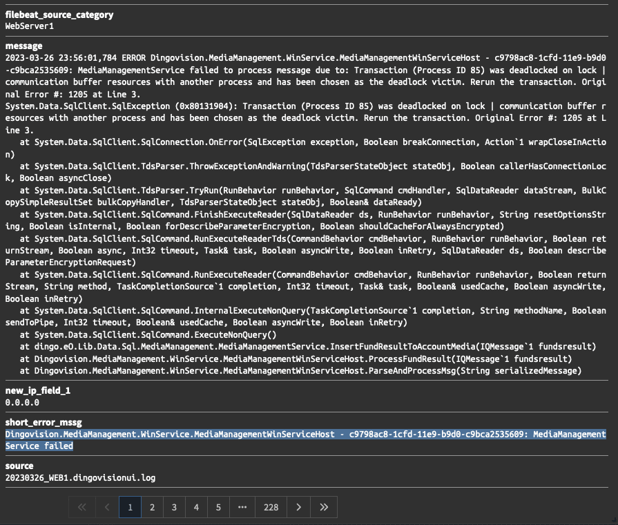
We can use this new field to group error types together. What does that look like you ask?
Error Count by Error Type
- Five-star deluxe view use to understand trends in application-level errors.
- Unusual spikes of errors are easily reviewed and correlated to the above view of “Error count by Application” to identify source.
- Any error identified as benign can be easily removed from this view by using a filter.

Filter: _exists_:short_error_message
Row: timestamp
Column: short_error_message
Metric: count()
Type: Bar Chart
Mode: Relative
This is very useful – and once you spot an error here you want to know more about, you can scroll down for the…
Error Drill-down by Error Type
- Here we delve into the message body of each error in detail. For this purpose we use a data-table.
- Having access to the full log message on this page in a format that can be easily read and saved to clipboard removes the need to work from multiple tabs.
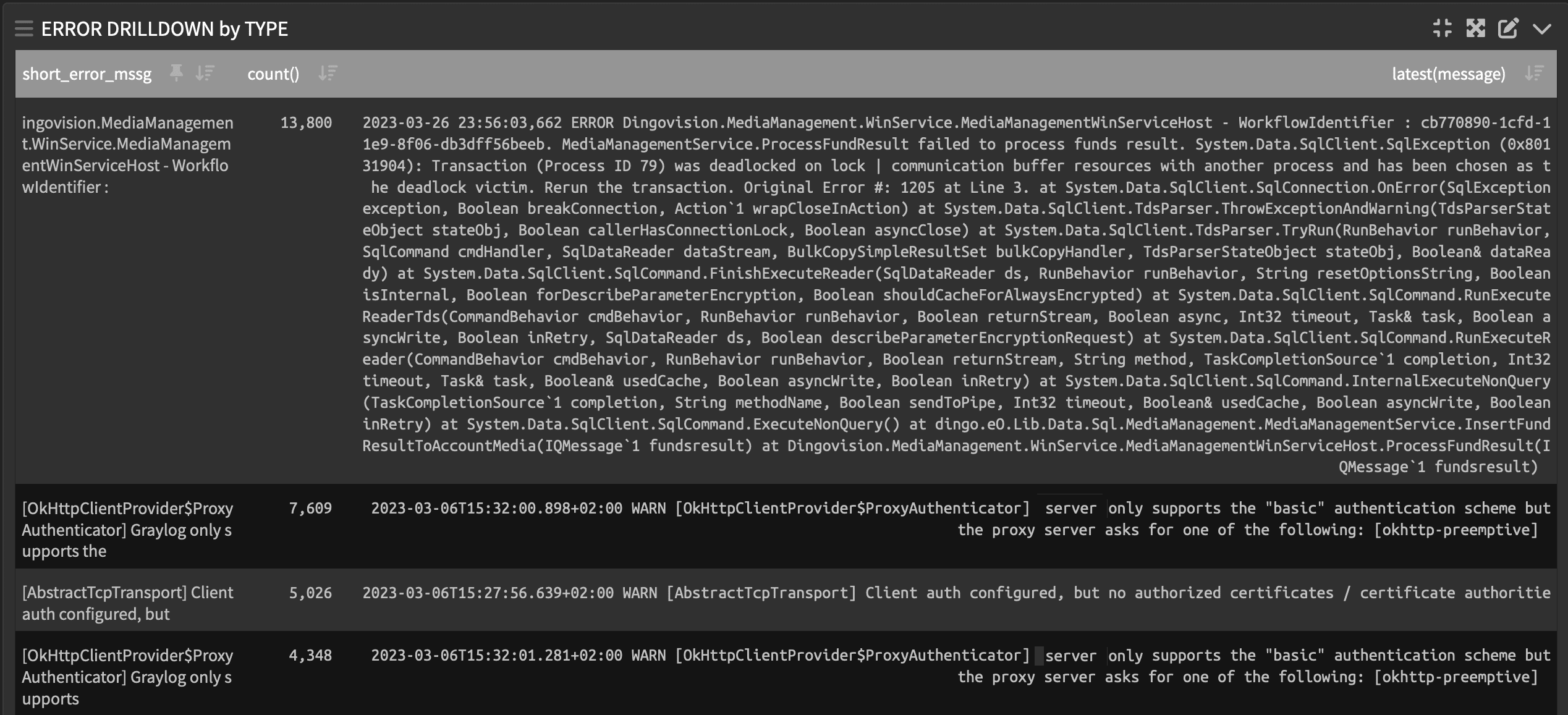
Filter: _exists_:short_error_message
Row: short_error_message
Metric: count()
Metric: latest(message)
Type: Data Table
We can see from the most frequent error in this table that there is an ongoing problem with Database deadlocks on a table, which is almost certainly the root cause of the interface errors the customer is reporting.
Capturing System Metrics
It can be useful to pull system metrics into Graylog to view alongside your logs. Finding a spike of errors or timeouts in an application log file makes more sense, as in this case, when you learn that the database that services the application was at 99% CPU utilization at the time!
System metrics are really a whole subject of their own, but to provide a summary of where they might fit in here, it would be useful to know the CPU and Memory utilization of the database and servers that the applications are installed to.
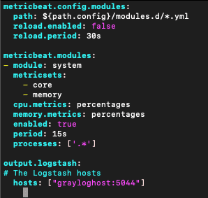
To quickly get these into Graylog, we can install MetricBeats onto each of our servers, with a configuration to send system metrics in to a Graylog Beats input.
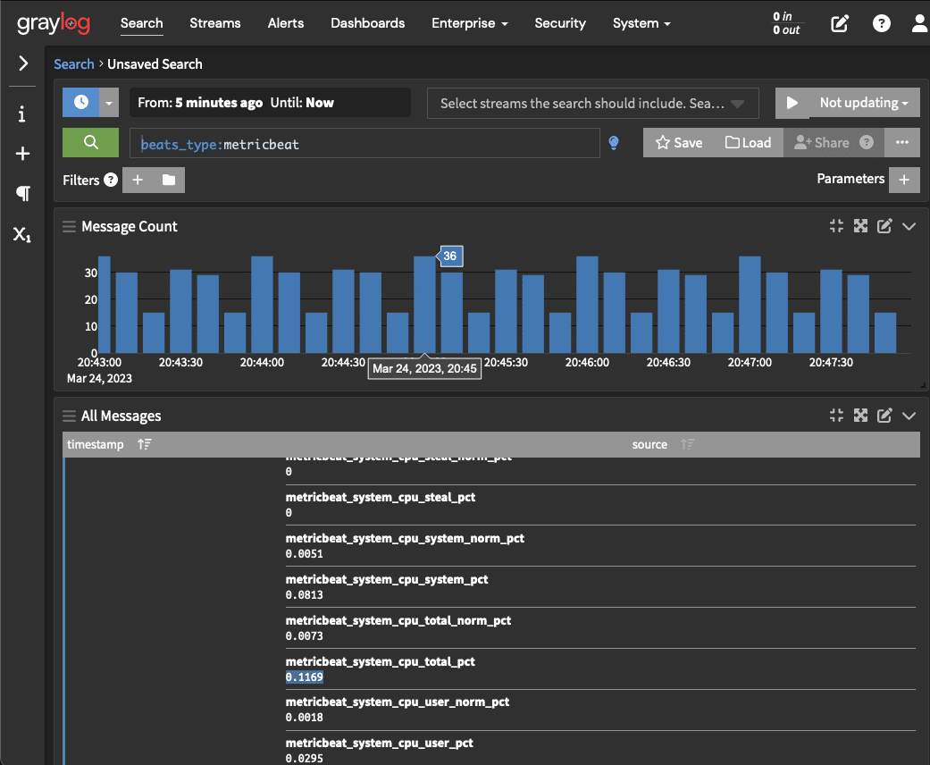
This data will allow us to create some simple dashboards for tracking resource utilization across our servers, for example:

Filter: beats_type:metricbeat
Row: timestamp
Column: source
Metric: max(metricbeat_ststem_cpu_total_pct)
Type: Bar Chart
Mode: Relative
Small Dashboard, Big Time Saver
That should be enough tooling to get us started!
Next time that customer phones to report the web front end is returning errors, the on-call Engineer will be able to quickly dust away the Cheetos and log onto this Dashboard. With all the evidence they need one one screen, the on-call engineer can quickly scroll down to get a picture of events – no more trawling logs and system metrics across multiple interfaces while the customer gets annoyed and SLAs breach.
When this incident has been resolved, as a follow up action the support team will create an alert in Graylog that triggers if this error is found in the logs again. Following best practice, the alert message will include instructions on what remedial actions the on-call Engineer should take upon receiving the alert. If this issue occurs again, the alert will facilitate a swift on-call response that can hopefully fix the problem next time before the customer even notices.
We hope this little case study was illustrative of how good dashboard design can help your Operations squad be superheroes.


